
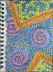
Greetings,
Sometimes I do not paint landscapes. Sometimes I experiment with new ideas. This is the creative doodling that shows us what we can achieve when we try something new. This is an experiment in making the dots look even more like tiles and using colors that would elevate certain parts toward or away from the viewer.
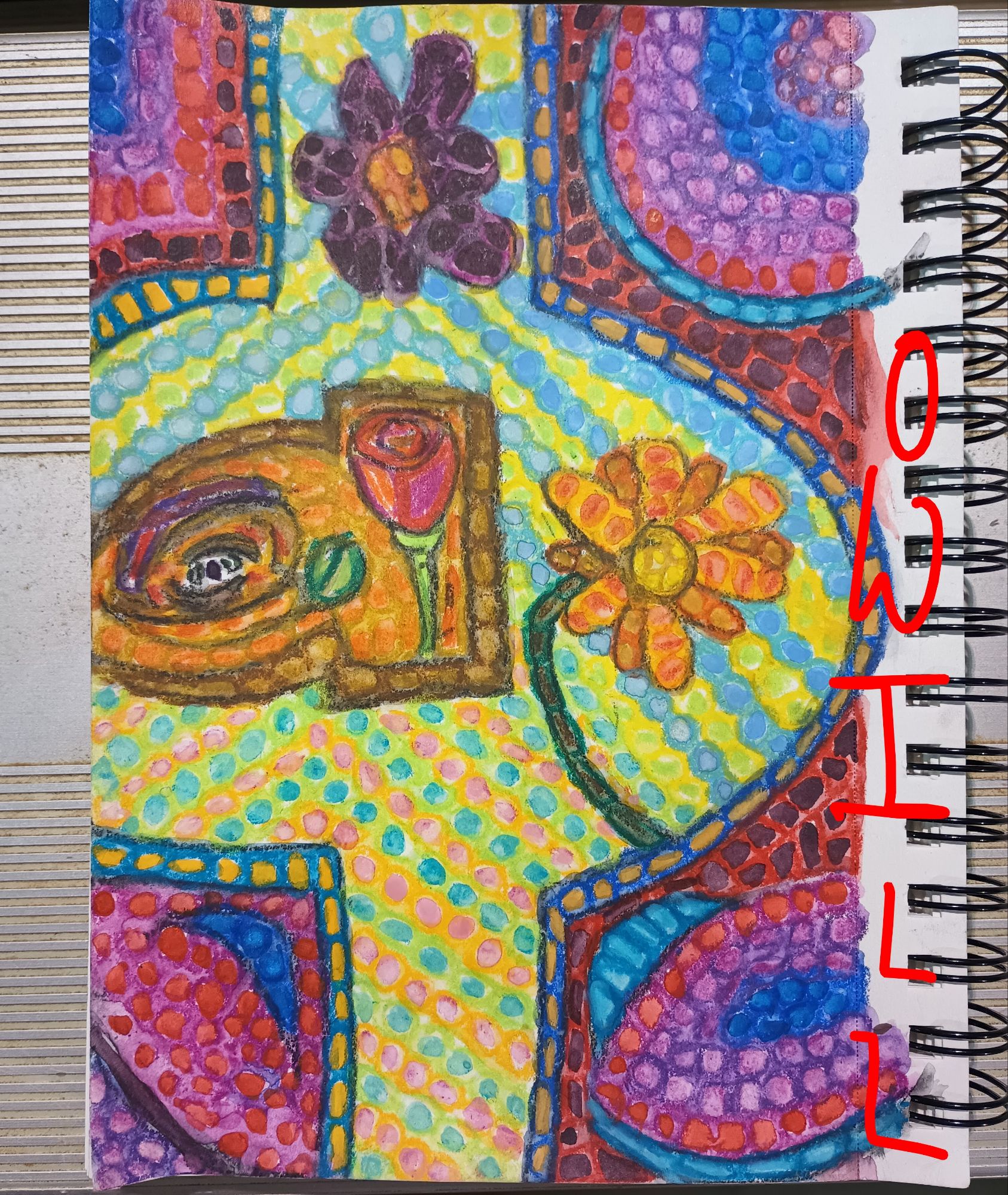
This watercolor painting is almost pure doodles. The dot patterns lead the eye through the painting and the areas of color create interest. I tried to make an eye in the middle left but decided it looks better as a knothole instead.
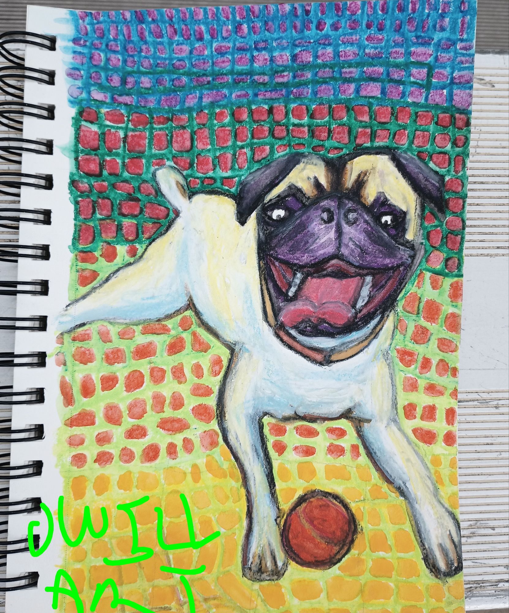
This painting is more representative, in that most people can tell the main subject is a dog. Many will also know this dog is a pug, by the ratio of the head to its legs and the muzzle. I used a photo I took as a reference for this painting and used the grid method to sketch it somewhat accurately to the paper. The tennis ball was green in the photo but creative license allowed me to choose a color that would bring the ball to the viewer, much like the pug is doing.
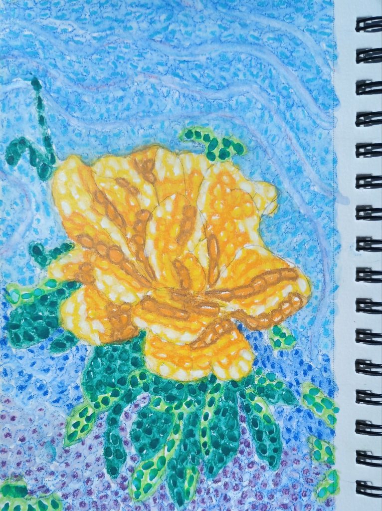
I wondered if I could capture a fully opened blooming rose in this medium. I vowed to only use yellow colors to show the light and dark parts of the rose. The background is somewhat mono-color in blue to not distract from the centerpiece.
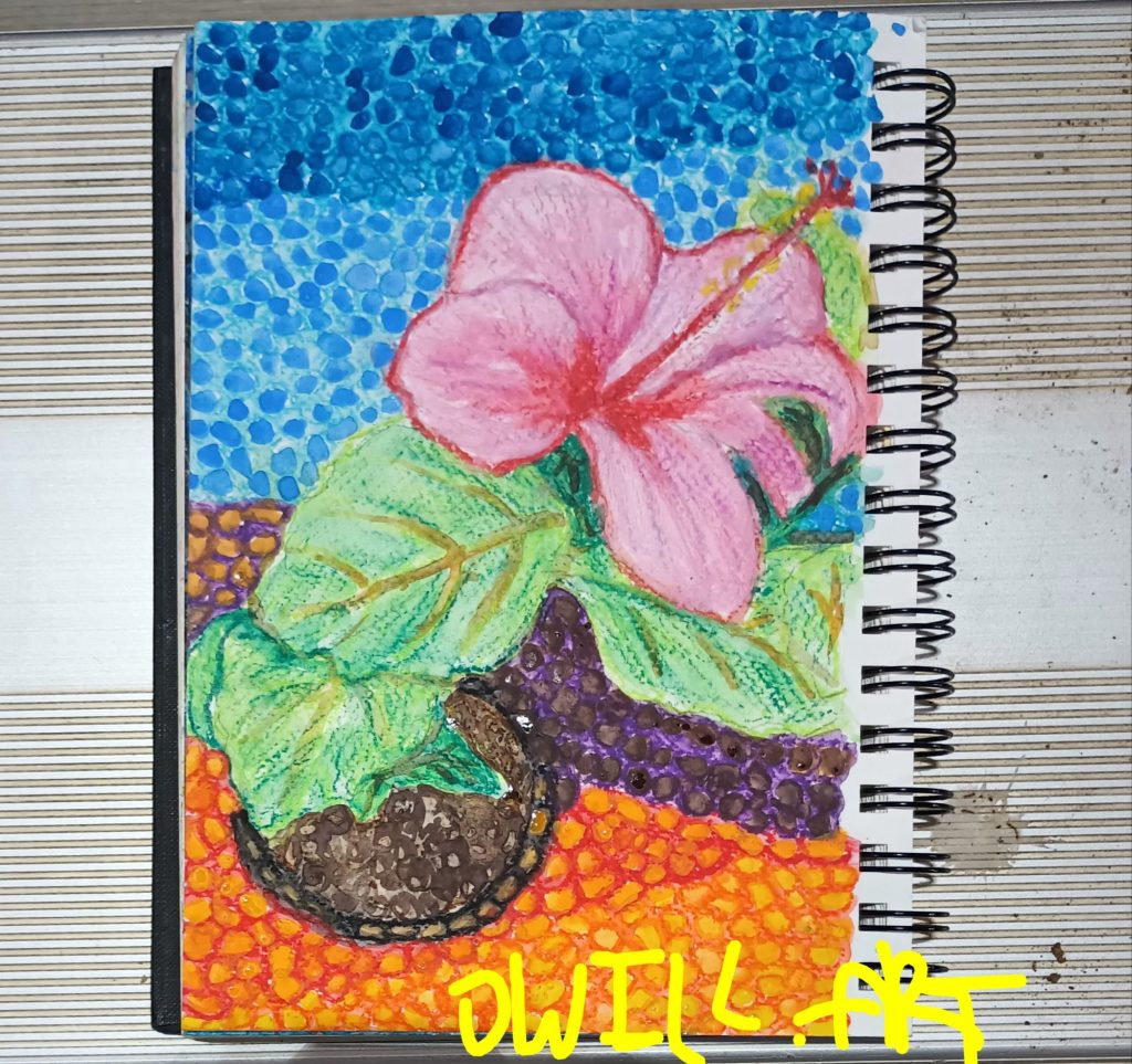
This is another flower painting, of a pink Hibiscus. This is a very colorful painting but for me is a little disjointed, as the leaves do not have depth and do not seem to be connected to anything. In hindsight I think I should have done the leaves in dot painting style and then they would have blended into the background.
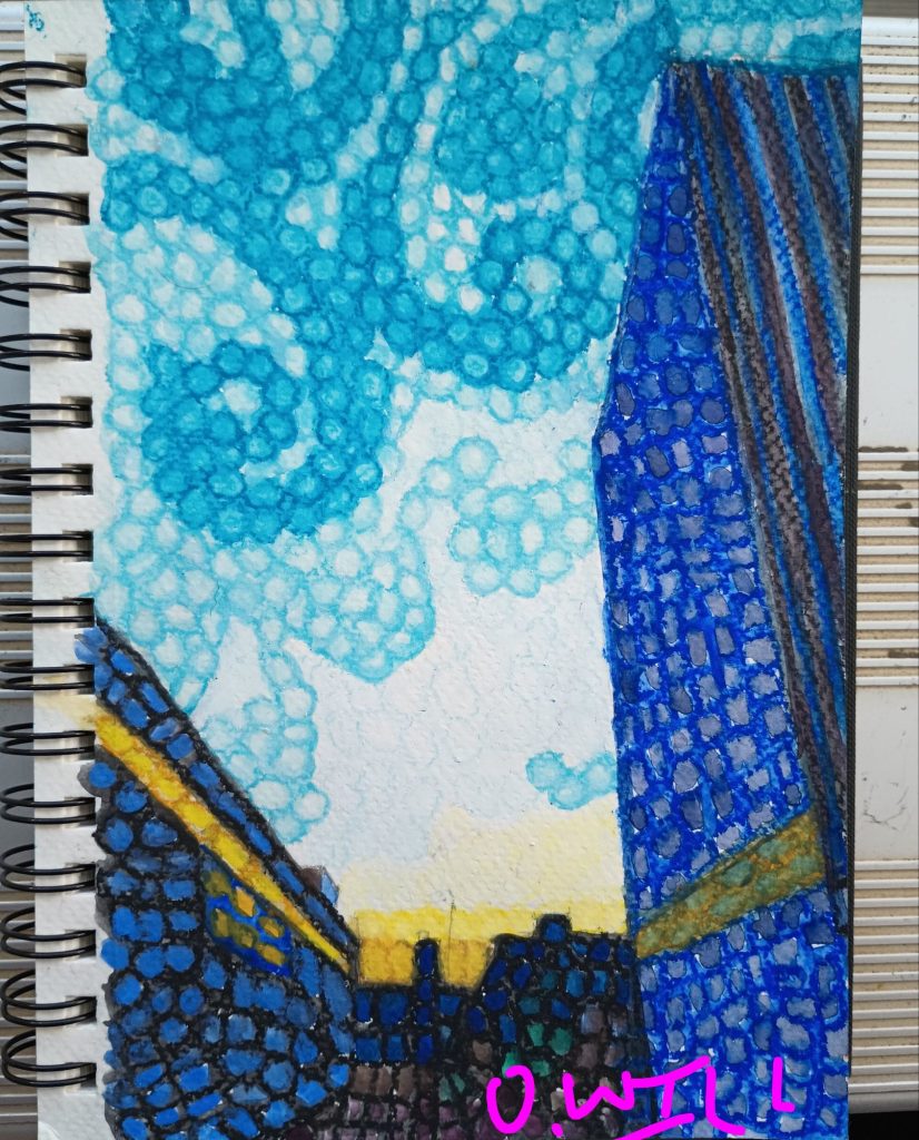
This is a painting based on a sunset photo snapped while walking in downtown Los Angeles. The yellow light of the sun was peeking through some tall building in the distance and bouncing around the shiny facades. I really enjoy this because it captures with great saturation the play of light on tall objects.
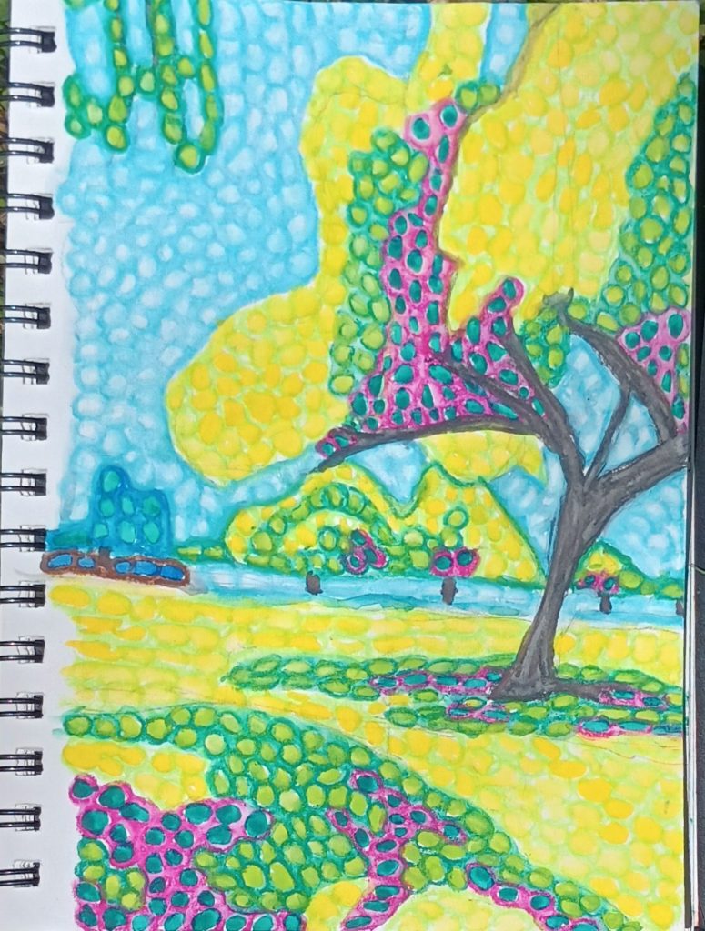
This is a colorful painting based on a scene I witnessed at a park. I wanted to have a great contrast between the sunlit leaves and the shaded leaves. There is no better contrast than complementary colors, in this case yellow and violet. Overall this turned out successful because although the pallet was limited, the subject of the painting shone through.
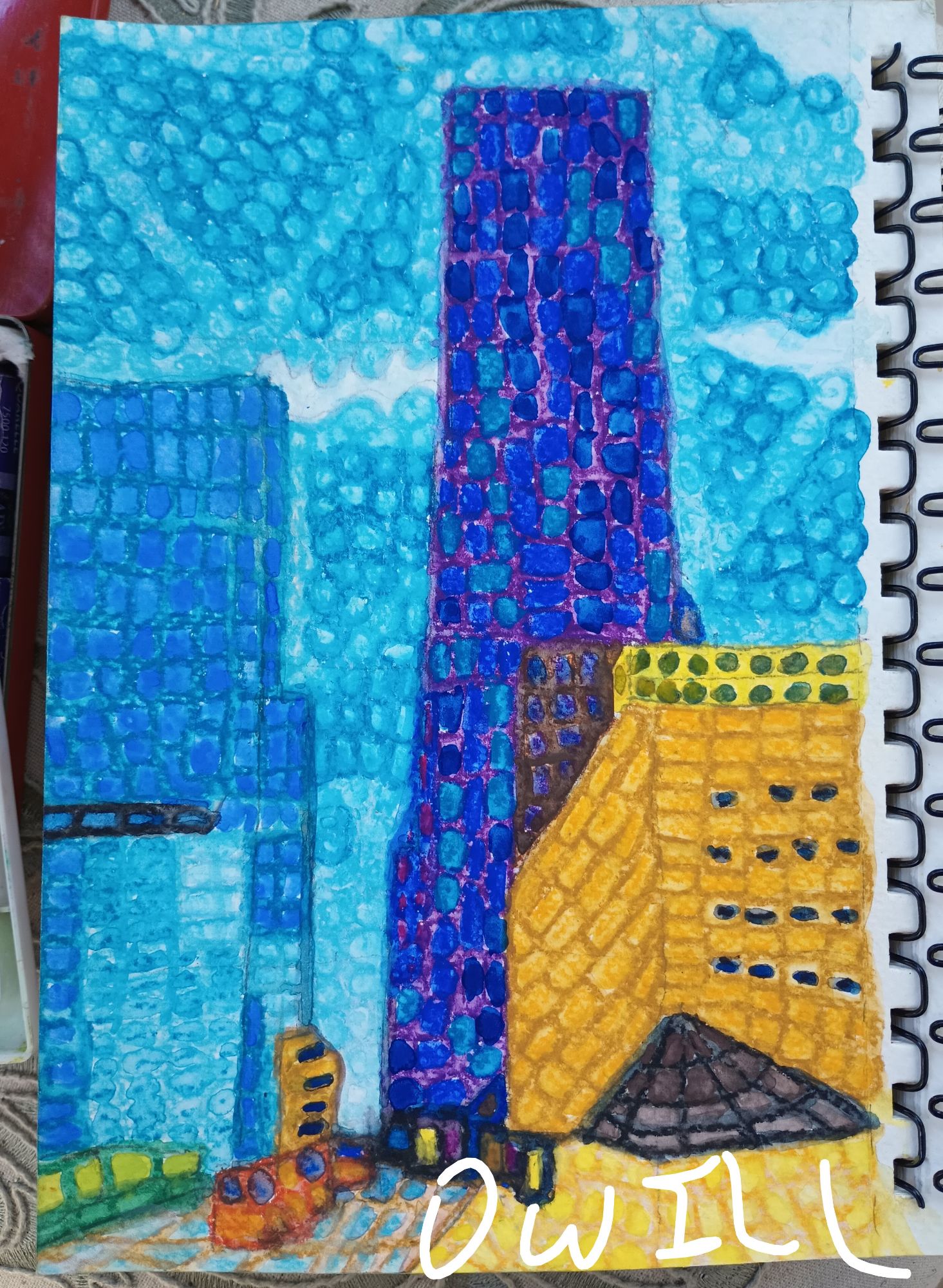
The Return to iconic Downtown Los Angeles. This is based off one or two other paintings of the same subject. One of those paintings was 11×14″ and was sold. Much like Monet and his haystacks, I think I will keep doing this subject over and over until I have expressed it in all styles and captured it in all lights.
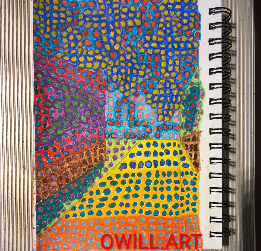
This is one of the paintings which I design to grab the viewer by the eyeballs and pull them in. Lines and colors all converging into one area and then your attention wanders, how did I get here? Some people have told me they see the inside of a house and others say its a road. I’ve left out all the details that would disqualify any of those perceptions.
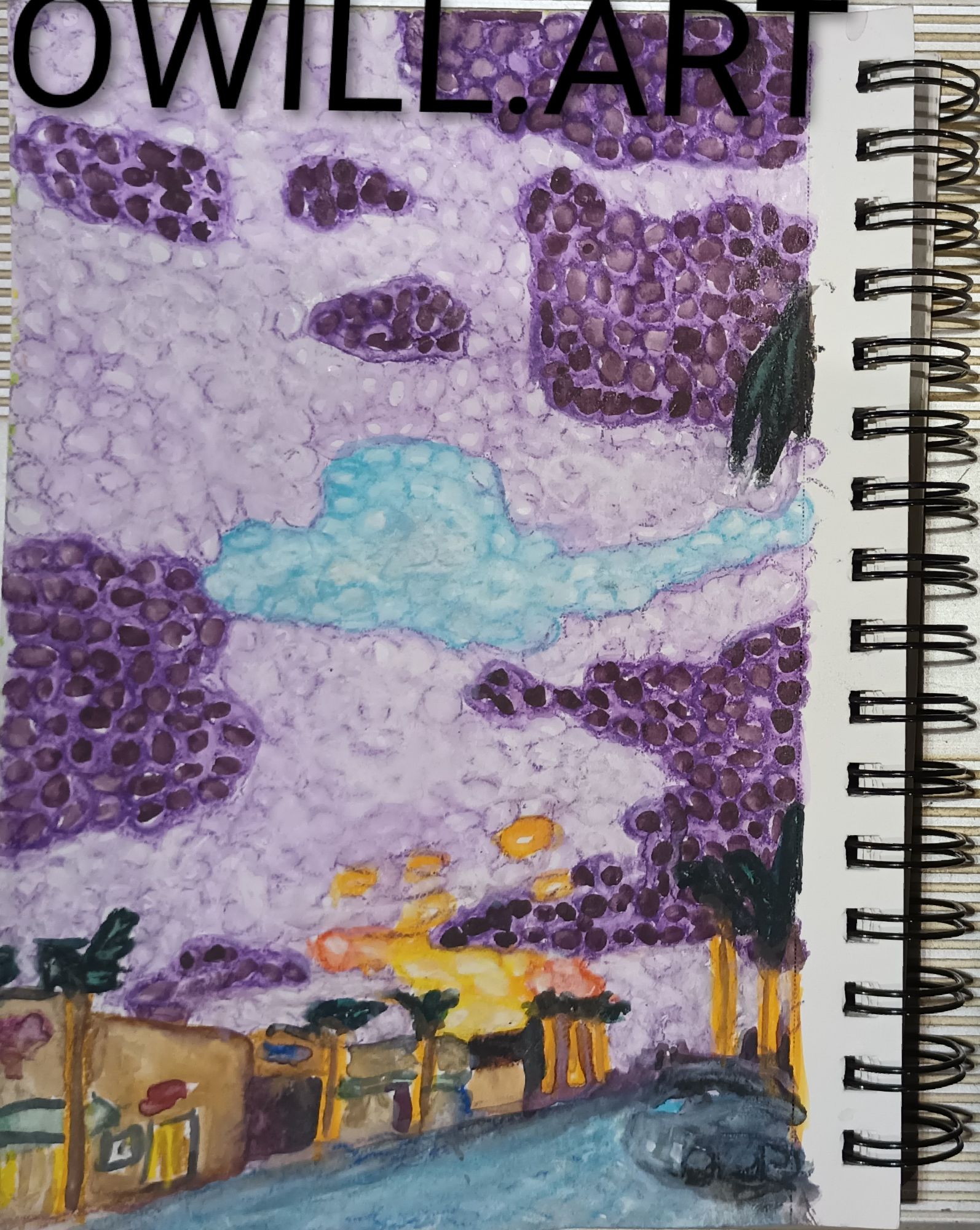
This is a nocturne street scene based on a photo I took. The sun was just about disappeared behind the buildings and the dramatic light all but drained from the street. The cloudy sky of violet has a small opening of blue left that is slowly closing. If I squint my eyes, though, it makes me wonder if instead the buildings are on fire and the clouds are black smoke.
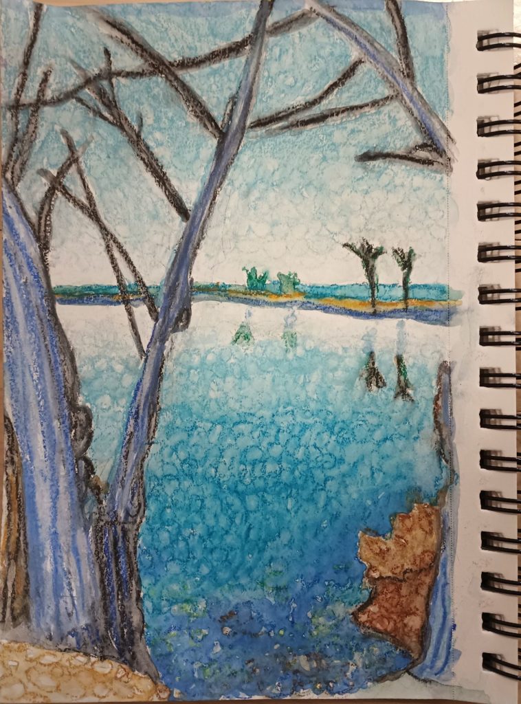
This is a painting based on a photo of the Sepulveda Basin Wildlife Preserve. I used the dots to illustrate gradients in the sky, water, and the soil. Two things were sought when painting this – to show the foreground/background relationship and to represent the water to the view. Water is a tough subject because it is always moving, even more than the sun creeping across the sky.
Discover more from OWILL.ART
Subscribe to get the latest posts sent to your email.